DYNAMIC CHECKBOX
The Dynamic Checkbox widget is a powerful tool that retrieves and displays selected checkbox values from JetEngine and ACF meta fields. It is compatible with both single values and arrays, providing versatile data handling capabilities. The widget can render values in multiple formats, such as plain text, list items, grids, and more. However, it currently does not support Glossary Labels.
USAGE & SCOPE
The source type you select determines the scope and context in which the widget can be used. Supported query sources include:
- JetEngine Listing Grid: Render values within listing grids.
- Current Post: Display checkbox values associated with the current post.
- Current User: Fetch values linked to the current logged-in user.
Note: The scope and usage of this widget are inherently tied to the query source. Ensure that the selected source has compatible checkbox data.

WIDGET SETTINGS
Configuration options for the Dynamic Checkbox widget, allowing for customized output formats and data handling.
WIDGET SETTINGS
-
Query Source:
Define the data source for the widget. Options include:
- JetEngine Listing Grid
- Current Post
- Current User
- Meta Field ID: Specify the meta field ID containing the checkbox values.
-
HTML Tag:
Define the HTML tag to wrap around each checkbox value (e.g.,
<div>,<li>,<span>). -
Output Format:
Determines how the checkbox values are rendered:
- Plain
- OL (Ordered List)
- UL (Unordered List)
- Flex
- Grid
- Icon: Optional icon to display before each checkbox value. (Does not apply to OL/UL formats)
- Items Gap: Adjust the spacing between each checkbox value.
- Delimiter: Applicable to Plain Output only. Defines the separator between values.
-
Flex Direction:
If using Flex Output, set the flow direction:
- Row
- Column
- Grid Columns: For Grid Output, define the number of columns to display.
-
Order Type:
Control the order in which values are displayed:
- Default
- Ascending
- Descending
- Random
- Hide if Empty: Prevents output rendering if the source meta field is empty.
- Fallback: Text to display if no checkbox values are found. (E.g., "No options selected")
- Advanced Output & Macro Rules: Configure complex output rules, conditional rendering, and custom styles.
EXAMPLE USAGE
If the checkbox meta field contains the following values:
- Red
- Blue
- Green
And the output format is set to UL, the rendered output could look like:
- Red
- Blue
- Green
If the output format is set to Plain with a delimiter of , , the result would be:
Red, Blue, Green
TUTORIAL & ADVANCED USAGE
1. Set the Source:
Choose the appropriate data source for the checkbox values.
- If you are using a single CPT template, set the Query Source to Current Post.
- If you need to pull data from a more complex structure (e.g., repeaters, CCT), use the Listing Grid option.
2. Assign the Meta Field ID:
Enter the meta field ID for the checkbox values. Ensure that the field is properly configured in JetEngine or ACF.
3. Select the Output Format:
Determine how the values should be displayed:
- For multi-column layouts, use Grid, allowing you to set the number of columns.
- For single-line or vertical stacks, use Flex and adjust the Flex Direction setting (Row/Column).
4. Sorting Options:
Customize the order of the displayed values:
- Default (Database order)
- Ascending (A-Z)
- Descending (Z-A)
- Random
5. Icon & Custom Styling:
If you want to add unique icons or styles to each checkbox item, use the Advanced Output feature.
Example:
<div class="custom-item">%first%</div>
This will apply a custom class to the first item, allowing targeted CSS styling.
6. Macro Commands and Custom HTML:
The following macro commands are available:
- %first% - Targets the first item
- %last% - Targets the last item
- %even% - Targets all even items
- %odd% - Targets all odd items
- %3% - Targets the third item
- %3n% - Targets every third item
- %value_checkboxvalue% - Targets a specific checkbox value (replace "checkboxvalue" with the actual value)
Example:
<div class="example">%3%</div>
This will apply the example class to the third item, allowing for targeted styling.
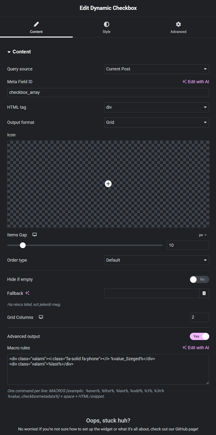
7. Icon Example:
You can also apply icons to specific checkbox values using custom HTML:
  <div class="custom-item">
    <i class="fa-solid fa-phone"></i> %value_Szeged%
  </div>
Images can also be applied using the <img> tag, following the same method.