WOOCOMMERCE DYNAMIC TAGS
Global dynamic tags are universal and can be used across all templates and widgets.
Important:
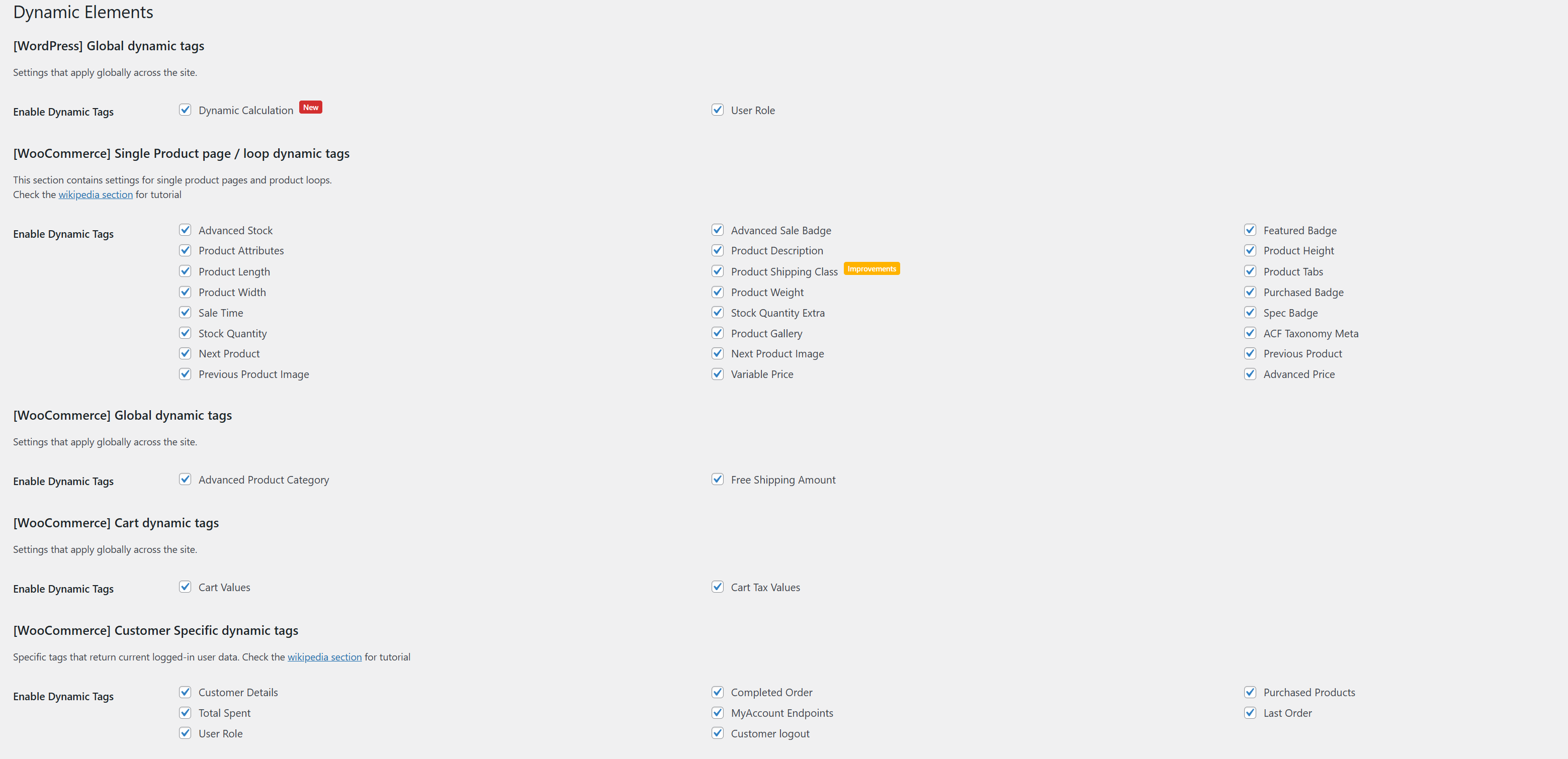
Product Tags
Description: This category includes tags that are specifically related to products. These tags are typically used within product single page templates and loops, such as Elementor loops or JetEngine listing grids.

ADVANCED PRICE Since v2.3.0
The Advanced Price tag returns the formatted price of a product, adhering to the WooCommerce settings. It can also optionally display tax information based on the store's tax configuration.
ADVANCED PRICE Since v2.3.0
Usage: Available in Product Single Template, Loop, and Listing Grid.
Scope: Current product only.
Settings:
- Show Tax Information: Enable this option to display tax information alongside the price. Example: `£100 (ex VAT)`
Macro Commands:
None
Example Usage:
If the product is priced at $100 and the store has a standard VAT of `20%`, the output with tax information enabled would be:
"$100 (ex VAT)" or "$120 (incl. VAT)", depending on the WooCommerce settings.
ADVANCED STOCK Since v1.0Improved in v2.4.2.2
The Advanced Stock tag provides the remaining stock quantity for a specific product.
ADVANCED STOCK Since v1.0Improved in v2.4.2.2
Usage: Available in Product Single Template, Loop, and Listing Grid.
Scope: Current product only.
Settings:
- Stock Text: Define the text to be displayed when the stock threshold is met. The text can include the `{remainingstock}` macro. Example: `"Only {remainingstock} left in stock!"`
- Stock Threshold: Set the minimum stock level required for the text to be displayed. If the stock quantity is below the threshold, the message will not appear.
- Text if out of stock: If it is not already in stock, you can show different text.
Macro Commands:
{remainingstock}- Displays the current remaining stock quantity.
Example Usage:
If the stock threshold is set to 5, and the product's stock quantity is 3, the output could look like:
"Only 3 left in stock!"
If the stock quantity is 6, and the threshold is 5, the output will be:
"Only 6 left in stock!"
If the stock quantity is 4, and the threshold is 5, no message will be displayed.
ADVANCED SALE BADGE Modified in v2.0.1
The Advanced Sale Badge tag displays discount information for a specific product in various formats, including text, numeric values, and percentages.
ADVANCED SALE BADGE Modified in v2.0.1
Usage: Available in Product Single Template, Loop, and Listing Grid.
Scope: Current product only.
Settings:
- Sale Text: Define the sale text to be displayed. You can use the provided macros to dynamically insert sale values. Example: `"Save {sale_number} today!"`
- Membership Sale Text: Specify the text for WooCommerce Membership-based discounts. This text will only appear for users with relevant memberships. Example: `"Members save {sale_percentage}%!"`
- Free Text: If the discount amount is `0`, specify the text to be displayed. Leave blank if no text is needed for free products. Example: `"Free for members!"`
- Currency and Format: Enable this option to apply the **WooCommerce currency settings** and number formatting to the output.
Macro Commands:
{sale_number}- Returns the discount amount in the configured currency.{sale_percentage}- Returns the percentage value of the discount.
Example Usage:
If a product is originally priced at $100 and is discounted to $80, the output could look like:
"Save $20 today!" (using {sale_number})
"Save 20%!" (using {sale_percentage})
If the product is marked as free for members, the `Free Text` setting will display the configured message. Example: `"Free for members!"`
View Image
FEATURED BADGE Since v1.0
The Featured Badge tag displays a custom text or WooCommerce's default "Featured" text when a product is marked as featured.
FEATURED BADGE Since v1.0
Usage: Available in Product Single Template, Loop, and Listing Grid.
Scope: Current product only.
Settings:
- Enable Custom Text: - When enabled, a custom text can be defined to replace WooCommerce’s default "Featured" label. - If left disabled, the default WooCommerce "Featured" text will be displayed. - Example: `"Hot Item!"`, `"Top Pick!"`, or `"Editor's Choice!"`
Macro Commands:
None
Example Usage:
If the product is marked as featured and the custom text is enabled with the value `"Editor's Choice!"` will be display. View Image
PRODUCT ATTRIBUTES Modified in v2.4.0
The Product Attributes tag displays product attributes in various formats, such as label, value, or both, with optional output styles like plain text, lists, or tables.
PRODUCT ATTRIBUTES Modified in v2.4.0
Usage: Available in Product Single Template, Loop, and Listing Grid.
Scope: Current product only.
Settings:
-
Display Type:
Choose how to display the attribute information. Options:
- Label: Only displays the attribute name.
- Value: Only displays the attribute values.
- Label/Value: Displays both the attribute name and its values.
- Linkable: Enable this option to make the attributes linkable to their archive pages.
- Attributes: Select specific attributes to display or choose to show all attributes. Multiple selection is supported.
-
Output Style:
Choose how the output should be structured:
- OL: Ordered list (`<ol>`)
- UL: Unordered list (`<ul>`)
- Plain: Delimiter-separated text
- Table: Table layout with optional custom headers
Note: When using the
Tablestyle, you can define custom headers. InPlainmode, a custom delimiter can be set.
Macro Commands:
None
Example Usage:
If the product has the following attributes: - Color: Red, Blue, Green - Size: S, M, L The output in `Label/Value` mode and `Table` format could look like:
| Attribute | Values |
|---|---|
| Color | Red, Blue, Green |
| Size | S, M, L |
In `Plain` mode with a custom delimiter set to `" | "`, the output would be: Color: Red | Blue | Green | Size: S | M | L
View Image
PRODUCT DESCRIPTION Since v1.0
The Product Description tag returns the complete product description. Optionally, a "Read More" function can be enabled for lengthy content.
PRODUCT DESCRIPTION Since v1.0
Usage: Available in Product Single Template, Loop, and Listing Grid.
Scope: Current product only.
Settings:
- Read More Toggle: Enable this option to limit the displayed content by character count and display a "Read More" link.
- Character Length: Set the number of characters to display before the "Read More" link appears. Example: `150`
- Read More Text: Define the clickable text for the "Read More" link. Example: `"Continue Reading..."`, `"Read Full Description"`
- Anchor ID: Specify the target `ID` where the "Read More" link should scroll to. Example: `"#full-description"`
Macro Commands:
None
Example Usage:
If the character length is set to `100` and the product description is longer, the output will look like: `"This is the beginning of the product description... " Read More`
View Image
PRODUCT DIMENSION, PRODUCT HEIGHT, PRODUCT LENGHT, PRODUCT WIDTH, PRODUCT WEIGHT Modified in v2.4.0
The Product Dimensions tags provide dynamic data related to the product's height, length, width, weight, and overall dimensions. These tags can optionally convert units from WooCommerce's default settings to another specified unit.
PRODUCT DIMENSION, PRODUCT HEIGHT, PRODUCT LENGHT, PRODUCT WIDTH, PRODUCT WEIGHT Modified in v2.4.0
Usage: Available in Product Single Template, Loop, and Listing Grid.
Scope: Current product only.
Tags Included:
- Product Height: Returns the product height.
- Product Length: Returns the product length.
- Product Width: Returns the product width.
- Product Weight: Returns the product weight.
- Product Dimensions: Combines the above tags into a single formatted output (e.g., "Height x Length x Width").
Settings:
You can only convert units within their respective measurement categories. Cross-category conversions (e.g., kg to m) are not supported.- Convert From: Specify the source unit (e.g., `cm`, `mm`, `kg`).
- Convert To: Specify the target unit to convert to (e.g., `in`, `ft`, `yd`).
- Store Unit: Displays the data in the original WooCommerce-defined unit without conversion.
Macro Commands:
None
Example Usage:
If the product is defined with the following dimensions:
- Height: 50 cm
- Length: 120 cm
- Width: 30 cm
- Weight: 2 kg
If the `Convert To` setting is set to `in` (inches), the output would be:
- Height: 19.7 in
- Length: 47.2 in
- Width: 11.8 in
- Weight: 4.4 lb
- Dimensions: 19.7 x 47.2 x 11.8 in
NEXT / PREVIOUS PRODUCT Since v2.1.0
The Next Product and Previous Product tags allow you to create custom navigation links within a product single template, enabling users to navigate to the next or previous product in the series.
NEXT / PREVIOUS PRODUCT Since v2.1.0
Usage: Primarily for use in Product Single Templates.
Scope: Current product only.
Settings:
-
Display Type:
Choose the data to display for the next or previous product:
- Product Title: Displays the title of the next/previous product.
- Product Price: Displays the price of the next/previous product.
- Product Link: Displays a clickable link to the next/previous product.
Macro Commands:
None
Example Usage:
If the current product is "Product B", and the previous product is "Product A" and the next product is "Product C", the output could look like:
Previous: "Product A - $50" Next: "Product C - $75"
View Image
NEXT / PREVIOUS PRODUCT IMAGE Since v2.3.0
The Next Product Image and Previous Product Image tags provide the featured image of the next or previous product. This can be useful for creating visually oriented product navigation.
NEXT / PREVIOUS PRODUCT IMAGE Since v2.3.0
Usage: Primarily for use in Product Single Templates.
Scope: Current product only.
Settings:
None
Macro Commands:
None
Example Usage:
Display the featured image of the next and previous products.
Example: ` `
`
PRODUCT TABS Since v2.2.2
The Product Tabs tag returns the content or title of a specific product tab. It supports both default WooCommerce tabs and custom tabs created via the TabManager plugin. It does not support the native WooCommerce Reviews tab.
PRODUCT TABS Since v2.2.2
Usage: Primarily for use in Product Single Templates.
Scope: Current product only.
Compatibility:
TabManager (by SkyVerge)
Additional Info:
If you're using JetEngine, you can access a Product Tab Empty condition in Dynamic Visibility to determine if a tab has content or not.
Settings:
- Tab Source: Choose whether to target the default tabs or the TabManager tabs.
- Choose Tab: Select the specific tab to use as the data source.
- Output: - Content: Displays the content of the selected tab. - Name: Displays the tab name.
Macro Commands:
None
Example Usage:
This tag is particularly useful if you want to build custom tab layouts using Elementor's Nested Tabs or Accordion widgets. For example, you can use the content output to dynamically display tab content within a custom accordion layout.
View Image
PRODUCT SHIPPING CLASS Modified in v2.4.0
The Product Shipping Class tag retrieves the shipping class information for a product, if defined. It allows you to display the class name, slug, or description. Only one option can be selected at a time.
PRODUCT SHIPPING CLASS Modified in v2.4.0
Usage: Available in Product Single Template, Loop, and Listing Grid.
Scope: Current product only.
Settings:
-
Return Value:
Select which shipping class information to display:
- Name: Displays the shipping class name (e.g., "Heavy Items").
- Slug: Displays the shipping class slug (e.g., "heavy-items").
- Description: Displays the shipping class description (if available).
Macro Commands:
None
Example Usage:
If a product is assigned to the "Heavy Items" shipping class with the slug "heavy-items" and a description of "Oversized products that require special handling," the output can be configured to display:
- Name: Heavy Items
- Slug: heavy-items
- Description: Oversized products that require special handling
PURCHASED BADGE Since v1.0.3
The Purchased badge tag displays a text if the product has already been purchased by the user.
PURCHASED BADGE Since v1.0.3
Usage: Available in Product Single Template, Loop, and Listing Grid.
Scope: Current product only.
Settings:
- Purchased text field
Macro Commands:
None
Example Usage:
Text display or indication that you have previously purchased the product. Useful if the product is limited.
View Image
SALE TIME Since v1.0.0
If the product is periodically set on sale it will return the date. Useful for countdown widgets.
SALE TIME Since v1.0.0
Usage: Available in Product Single Template, Loop, and Listing Grid.
Scope: Current product only.
Settings:
- None
Macro Commands:
None
Example Usage:
You can set it in the Elementor countdown widget, for example, so the counter shows how long the promotion is live.
View Image
SPECIAL BADGE Since v1.0.0 Improved in v2.3.0
Outputs contextual product badges (Featured, Digital, Virtual, Sold Individually, External, Sale and more) based on product type and integrations.
SPECIAL BADGE Since v1.0.0 Improved in v2.3.0
Usage: Available in Product Single Template, Loop, and Listing Grid.
Scope: Current product only.
Settings:
- Enable Custom Text: Allow custom wording for every supported badge (e.g. replace "Featured" with "Editor Pick").
- Exclude Features: Remove specific badge types from the output (featured, sold individually, digital, virtual, external, sale, plus subscription/bundle when the relevant plugins are active).
- Per-badge Custom Text: When custom text is enabled, individual controls let you override the label for each product type, including WooCommerce Subscriptions and Product Bundles integrations.
Macro Commands:
None
Example Usage:
If a product is featured, on sale, and a subscription, the tag can output "Editor Pick, Holiday Deal, Subscription" depending on your custom labels.
STOCK QUANTITY Since v1.0.0
Returns the raw stock quantity for the current product.
STOCK QUANTITY Since v1.0.0
Usage: Available in Product Single Template, Loop, and Listing Grid.
Scope: Current product only.
Settings:
- None
Macro Commands:
None
Example Usage:
Displays an integer such as "24". If stock management is disabled (quantity is undefined) the tag outputs nothing.
STOCK QUANTITY EXTRA Since v1.0.0Improved in v2.4.2.2
Smart stock messaging that can display labels for in-stock/out-of-stock states and optionally append the numeric quantity.
STOCK QUANTITY EXTRA Since v1.0.0Improved in v2.4.2.2
Usage: Available in Product Single Template, Loop, and Listing Grid.
Scope: Current product only.
Settings:
- Show Label: Append custom text (e.g. "in stock") after the numeric quantity. When disabled only the number is displayed.
- Stock Visibility: Choose whether to hide the tag for undefined stock quantities or when the product is out of stock.
- Label position Set the label position before or after the quantity values
- In Stock / Out of Stock Text: Customise the messages shown for each status. Falls back to WooCommerce defaults if left empty.
Macro Commands:
None
Example Usage:
With label enabled the output can read "5 available"; when the product is out of stock you can display a custom notice like "Temporarily unavailable".
VARIABLE PRICE RANGE Since v2.2.0
Outputs the minimum price, maximum price, or full price range for variable products using WooCommerce formatting.
VARIABLE PRICE RANGE Since v2.2.0
Usage: Available in Product Single Template, Loop, and Listing Grid.
Scope: Current product only.
Settings:
- Price Output: Choose between minimum price, maximum price, or the full range.
- Price Range Separator: Custom separator for the range output (default " - ").
- Hide if Product not Variable: Stop rendering when the product is not variable; otherwise the product price HTML is returned as a fallback.
Macro Commands:
None
Example Usage:
A variable product with prices between $29 and $59 can display "$29 - $59", or just the minimum/maximum value depending on your configuration.
Customer Tags
Description: These tags provide dynamic data related to the current logged-in customer. They can be used anywhere across the website, not just on the My Account page.
- Note: The tags will always consider the currently logged-in user. If the user is a guest, no data will be displayed.
CUSTOMER DETAILS Since v1.0.0
Outputs billing or shipping profile fields for the currently logged-in customer.
CUSTOMER DETAILS Since v1.0.0
Usage: Available site-wide.
Scope: Current customer.
Settings:
- Detail Type: Switch between billing and shipping data.
- Billing / Shipping Detail: Select the specific field to display (full name, name parts, company, city, address, phone, email).
- Fullname Output: Choose the order of first/last name when requesting the full name.
Macro Commands:
None
Example Usage:
Display "Jane Doe" in a personalised heading or output the billing email inside a contact widget.
COMPLETED ORDER Since v1.0.0
Returns the number of completed WooCommerce orders placed by the logged-in customer.
COMPLETED ORDER Since v1.0.0
Usage: Available site-wide.
Scope: Current customer.
Settings:
- None
Macro Commands:
None
Example Usage:
Show loyalty stats such as "Orders completed: 7" on a personalised dashboard.
PURCHASED PRODUCTS Since v1.0.3
Lists the unique products a customer has purchased, either by ID or title, with optional linking.
PURCHASED PRODUCTS Since v1.0.3
Usage: Available site-wide.
Scope: Current customer.
Settings:
- Output Type: Return product IDs or titles.
- Linkable: Convert product titles into hyperlinks.
- Link Target: Decide whether links point to the product page or the related order.
Macro Commands:
None
Example Usage:
Generate a comma-separated list like "Annual Plan, VIP Support" linking to the customer's past purchases.
TOTAL SPENT Since v1.0.0
Calculates the cumulative value of the customer's completed WooCommerce orders.
TOTAL SPENT Since v1.0.0
Usage: Available site-wide.
Scope: Current customer.
Settings:
- Formatted Output: Toggle WooCommerce currency formatting. Disable to fetch the raw numeric total.
Macro Commands:
None
Example Usage:
Display a loyalty summary like "Total spent: $1,245.00".
MY ACCOUNT MENU LINKS Since v2.0.1
Outputs the URL for any WooCommerce My Account endpoint, respecting custom menu labels and rewrites.
MY ACCOUNT MENU LINKS Since v2.0.1
Usage: Available site-wide.
Scope: Current customer.
Settings:
- Select Endpoint: Choose from all active My Account menu items (Orders, Downloads, Subscriptions, etc.).
Macro Commands:
None
Example Usage:
Attach buttons linking to "/my-account/orders/" or other endpoints without hardcoding URLs.
LAST ORDER Since v1.0.0
Returns data from the customer's most recent order (ID, status, date, items, totals, shipping, payment).
LAST ORDER Since v1.0.0
Usage: Available site-wide.
Scope: Current customer.
Settings:
- Order Data: Select the order property to output (ID, status, date, item list, item count, totals, tax, shipping method, payment method).
- Linkable: When outputting the order ID, optionally link it to the WooCommerce order view page.
Macro Commands:
None
Example Usage:
Show a recap like "Last order on 12 Aug 2025 - Completed" or list the items in the most recent purchase.
USER ROLE Since v1.0.0
Outputs the translated display names of every role assigned to the current user.
USER ROLE Since v1.0.0
Usage: Available site-wide.
Scope: Current customer.
Settings:
- None
Macro Commands:
None
Example Usage:
Show "Administrator, Shop Manager" for multi-role accounts to power conditional copy or badges.
CUSTOMER LOGOUT URL Since v2.1.1
Provides the WooCommerce logout URL so you can build custom logout buttons in Elementor.
CUSTOMER LOGOUT URL Since v2.1.1
Usage: Available site-wide.
Scope: Current customer.
Settings:
- None
Macro Commands:
None
Example Usage:
Bind the URL to a button widget to redirect users through WooCommerce's logout flow.
Order Tags
Description: These tags expose WooCommerce order data specifically for JetEngine Listing Grids powered by the WC Order HPOS query type (introduced in v2.4.3).
ORDER ID Since v2.4.3
Outputs the order ID with an optional link to the My Account “view order” page.
ORDER ID Since v2.4.3
Usage: JetEngine Listing Grid item templates (WC Order HPOS query).
Scope: Current order.
Settings:
- Linkable: Wrap the ID in the customer-facing view order URL.
Example Usage:
Display Order #1542 or convert it into a hyperlink leading to the My Account page.
ORDER DATE Since v2.4.3
Returns the localized order creation date, using the site-wide WordPress date format by default.
ORDER DATE Since v2.4.3
Usage: JetEngine Listing Grid item templates (WC Order HPOS query).
Scope: Current order.
Settings:
- Date Format: Provide a custom PHP date format or leave blank to inherit the WordPress setting.
Example Usage:
Show metadata such as Placed on: 28 Oct 2025.
ORDER STATUS Since v2.4.3
Displays the human-readable WooCommerce status label (Processing, Completed, etc.).
ORDER STATUS Since v2.4.3
Usage: JetEngine Listing Grid item templates (WC Order HPOS query).
Scope: Current order.
Example Usage:
Add a badge such as Status: Completed to administrative order dashboards.
ORDER LINK Since v2.4.3
Provides the My Account “view order” URL, ready to bind to buttons or links.
ORDER LINK Since v2.4.3
Usage: JetEngine Listing Grid item templates (WC Order HPOS query).
Scope: Current order.
Example Usage:
Attach the link to an Elementor button labelled View Order.
TOTAL PRICE Since v2.4.3
Outputs the WooCommerce-formatted order total, including currency and localisation.
TOTAL PRICE Since v2.4.3
Usage: JetEngine Listing Grid item templates (WC Order HPOS query).
Scope: Current order.
Example Usage:
Display $149.00 beneath each order summary.
ORDER ITEMS COUNT Since v2.4.3
Calculates the total quantity of products in the order.
ORDER ITEMS COUNT Since v2.4.3
Usage: JetEngine Listing Grid item templates (WC Order HPOS query).
Scope: Current order.
Example Usage:
Show quick stats such as Items: 4.
ORDERED ITEMS Since v2.4.3
Lists ordered products with quantity, supports nested variation output, and offers custom separators.
ORDERED ITEMS Since v2.4.3
Usage: JetEngine Listing Grid item templates (WC Order HPOS query).
Scope: Current order.
Settings:
- Display Format: Plain (separator-based) or unordered list.
- Separate Variable: Group variation attributes under the parent product.
- Variation Label & Attribute Names: Custom prefix and control over whether attribute labels (e.g. "Color:") are shown.
- Plain Separator / Split Row: Configure the separator and control whether variation data breaks onto a new line.
- Variation CSS Class: Apply a custom CSS class to variation wrappers.
Example Usage:
Produce nested lists such as Smart Watch → Colour: Beige or plain summaries like Smart Watch × 2, Travel Charger.
ORDER CUSTOMER Since v2.4.3
Outputs the billing full name or the billing email recorded on the order.
ORDER CUSTOMER Since v2.4.3
Usage: JetEngine Listing Grid item templates (WC Order HPOS query).
Scope: Current order.
Settings:
- Customer Detail: Switch between formatted full name or billing email.
Example Usage:
Display Jane Doe or jane@example.com within order cards.
ORDER PAYMENT METHOD Since v2.4.3
Displays the payment gateway title, falling back to the gateway ID if the title is not available.
ORDER PAYMENT METHOD Since v2.4.3
Usage: JetEngine Listing Grid item templates (WC Order HPOS query).
Scope: Current order.
Example Usage:
Render badges such as Paid via Stripe or Cash on Delivery.
Cart Tags
Description: These tags provide data related to the shopping cart. They can be placed anywhere on the site and will display cart information for the current visitor or logged-in user.
- Note: The cart tags do not update via AJAX at this time. AJAX support is planned for version 2.5.0.
CART VALUES Since v1.0.0
Displays cart totals, product lists, or cart item counts using WooCommerce cart data.
CART VALUES Since v1.0.0
Usage: Available site-wide.
Scope: Current visitor cart.
Settings:
- Cart Value: Choose between returning item names, the formatted cart total, or the number of items.
- Delimiter: When returning items, define how product names are separated (default ", ").
- Show Price Symbol: Toggle currency formatting for the cart total.
- Include Tax: Decide whether the cart total should include cart content tax.
- Hide if Cart Empty: Prevent output when the cart has no items.
Macro Commands:
None
Example Usage:
Configure the tag to display "$152.00" for the cart total, or show a comma-separated list such as "T-Shirt, Hoodie, Mug".
CART TAX VALUES Since v1.0.0
Returns the total tax collected on the current cart contents.
CART TAX VALUES Since v1.0.0
Usage: Available site-wide.
Scope: Current visitor cart.
Settings:
- Show Price Symbol: Toggle WooCommerce currency formatting. When disabled the value is returned as a plain number using store decimal/thousand separators.
Macro Commands:
None
Example Usage:
Displays the cart tax as "$12.74" or "12.74" depending on the formatting option.
FREE SHIPPING AMOUNT Since v1.0.0
Shows the lowest cart total required to unlock any configured free-shipping method.
FREE SHIPPING AMOUNT Since v1.0.0
Usage: Available site-wide.
Scope: Global shipping settings.
Settings:
- None
Macro Commands:
None
Example Usage:
If any shipping zone offers free shipping above $75, the tag outputs "$75.00" so you can encourage customers to reach the threshold.